Code
# functions we'll need for this analysis
box::use(
readr[read_csv],
tidyr[pivot_longer],
DT[datatable],
dplyr[...],
ggplot2[...],
lubridate[as_date, yday, today, month, mday],
scales[label_date],
stringr[str_glue],
plotly
)
As of March 24, Utah broke a 40 year old record for largest snowpack in 40 years. There has been a beautiful interactive chart floating around the internet provided by the USDA that effectively shows yearly snow water accumulation over the years. I thought it would be fun to attempt to reproduce the plot using R.

# functions we'll need for this analysis
box::use(
readr[read_csv],
tidyr[pivot_longer],
DT[datatable],
dplyr[...],
ggplot2[...],
lubridate[as_date, yday, today, month, mday],
scales[label_date],
stringr[str_glue],
plotly
)On the main page where the chart is hosted, there is a link to the source of the data, making it super convenient to pull the up-to-date data used to create the chart. I’ve also included a link to it here.
This type of data source is a web-hosted csv file. The {readr} package can handle this file just as it would any other csv.
snow <- read_csv("https://www.nrcs.usda.gov/Internet/WCIS/AWS_PLOTS/basinCharts/POR/WTEQ/assocHUCut3/state_of_utah.csv")Let’s take a look at the structure of data.
datatable(snow)In this format, each year gets its own column (wide format). While this is a nice way to view the data, it’s not ideal for plotting. We need to “tidy” the data by pivoting to a longer format. The pivot_longer function from the {tidyr} package makes this task effortless.
snow_long <-
snow |>
pivot_longer(
cols = `1981`:`2023`,
names_to = "year",
values_to = "snowpack",
values_drop_na = T
) |>
select(date, year, snowpack)
datatable(snow_long)ggplot2Now that the data are in “long” format, let’s attempt to make a basic visualization.
The variable snowpack is in terms of inches of snow water equivalent. For simplicity’s sake, I’ll just continue calling it snowpack.
snow_long |>
ggplot(aes(date, snowpack, color = year)) +
geom_line()
What happened? The reason it looks like this is because our date variable isn’t the appropriate type.
str(snow_long$date) chr [1:15649] "10-01" "10-01" "10-01" "10-01" "10-01" "10-01" "10-01" ...We need to convert date from a chr to a date using the as_date function from {lubridate}. We will add a simple mutate to do the conversion and feed the data straight back into a ggplot.
snow_long |>
mutate(date = as_date(date, format = "%m-%d")) |>
ggplot(aes(date, snowpack, color = year)) +
geom_line()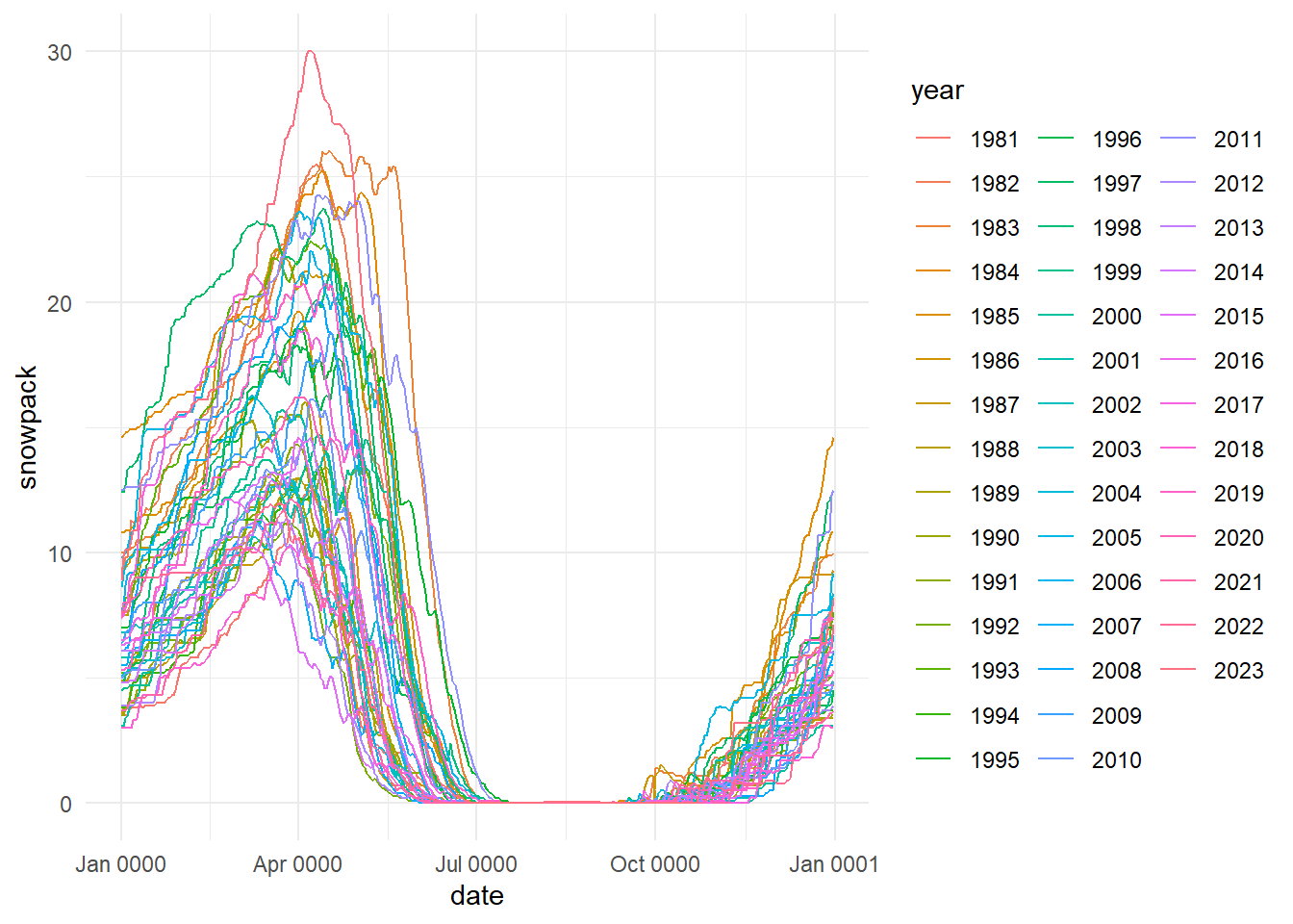
This is looking better, but something is still off. If you look back at the original plot, the data should start in October, not January. The reason this happened is that when we converted the date variable to a date type, we didn’t account for the year. We need to account for the fact that the data starts in October and rolls into the next year.
The easiest way to do this in my opinion is to first extract the day of the year from the date, and then add that number of days to Jan 1 of either the “first year” or the “second year”, based on the “threshold” day (Oct 1). In other words, any day after Oct 1 (day 275) should be in the “first year” and every other day should be assigned to the “second year”.
Don’t worry that I picked 2021 and 2022 for my first and second years, we will ignore year for now and deal with it later.
snow_temp <-
snow_long |>
mutate(
date = as_date(date, format = "%m-%d") |> yday(),
date = if_else(date >= 275, as_date("2021-01-01") + date,
as_date("2022-01-01") + date)
)
snow_plot <-
snow_temp |>
ggplot(aes(date, snowpack, color = year)) +
geom_line() +
scale_x_date(labels = label_date("%b"), breaks = "month") +
labs(
title = "Utah Snowpack",
x = NULL,
y = "Snow Water Equivalent (in.)",
color = NULL
)
snow_plot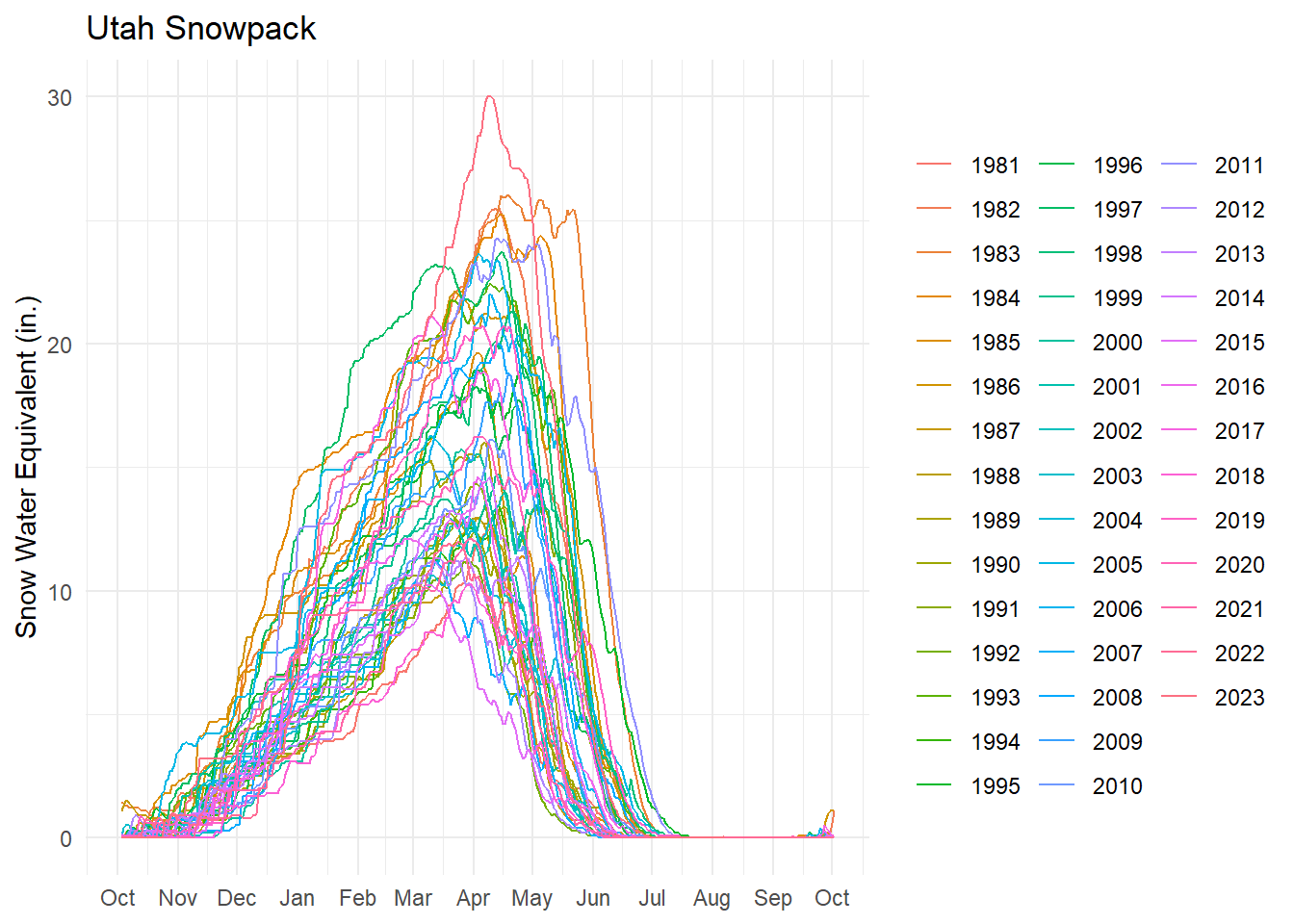
PlotlyExcellent! Our plot is accurately showing the data as in the USDA original! This is still kind of an ugly plot however. Even with a legend, it’s hard to know which line corresponds with which year. The original chart allowed users to interact with the data and select which years they wanted to show.
Lucky for us, there is a super quick hack that will turn our plot interactive in a single function call! The function comes from the {plotly} package which provides an api to the plotting software used on original USDA chart.
box::use(plotly[ggplotly])
ggplotly(snow_plot)Now we have nice tooltips and a legend that let’s us filter which years we want to view. Try it yourself by double clicking on 1983 in the legend to deselect everything except that year, and then pick 2023 to compare the top 2 years for snowpack.
Let’s make one more fix to make our plot more accurate. You’ll notice that we still see 2021 and 2022 as the years for the date in the tooltip. This is because plotly automatically pulls the raw value regardless of how we changed the axis labels. To fix this, we can format a text variable to make a more attractive tooltip, and then pass that in to our call to ggplotly.
snow_plot2 <-
snow_temp |>
mutate(
tooltip = str_glue(
"{month(date, label = T, abbr = T)} {mday(date)}, {year}
Snowpack (in): {snowpack}"
)
) |>
ggplot(aes(date, snowpack, color = year, text = tooltip, group = year)) +
geom_line() +
scale_x_date(labels = label_date("%b"), breaks = "month") +
labs(
title = "Utah Snowpack",
x = NULL,
y = "Snow Water Equivalent (in.)",
color = NULL
)
ggplotly(snow_plot2, tooltip = "text")Let’s say we wanted to recreate the plot daily so that it reflects the most recent data. We should probably capture the whole process in a single function. I will demonstrate that below, with a minor change. We will transform our date variable before we pivot the data, to be slightly more efficient. We can also add in function parameters, to make the plotting more flexible.
create_snow_plot <- function(title = "Utah Snowpack", .interactive = T) {
snow_raw <- read_csv("https://www.nrcs.usda.gov/Internet/WCIS/AWS_PLOTS/basinCharts/POR/WTEQ/assocHUCut3/state_of_utah.csv")
snow_plot <-
snow_raw |>
mutate(
date = as_date(date, format = "%m-%d") |> yday(),
date = if_else(date >= 275, as_date("2021-01-01") + date,
as_date("2022-01-01") + date)
) |>
pivot_longer(
`1981`:`2023`, names_to = "year",
values_to = "snowpack", values_drop_na = T
) |>
mutate(
tooltip = str_glue(
"{month(date, label = T, abbr = T)} {mday(date)}, {year}
Snowpack (in): {snowpack}"
)
) |>
ggplot(aes(date, snowpack, color = year, text = tooltip, group = year)) +
geom_line() +
scale_x_date(labels = label_date("%b"), breaks = "month") +
labs(
title = title,
x = NULL,
y = "Snow Water Equivalent (in.)",
color = NULL
)
if (.interactive) {
ggplotly(snow_plot, tooltip = "text")
} else {
snow_plot
}
}
create_snow_plot(title = str_glue("Utah Snowpack as of {today()}"))echarts4r)Let’s recreate the plot one more time using another one of my favorite plotting packages, {echarts4r}. This package is simple to use and makes very attractive looking plots right out of the box. It also has a couple neat features that add unique interactivity capabilities to your charts.
I’m going to forgo adding titles and axis labels, for the sake of simplicity. Those things are simple to implement however.
box::use(echarts4r[...])
snow_temp2 <-
snow_long |>
mutate(
day_of_year = as_date(date, format = "%m-%d") |> yday(),
year = as.numeric(year),
date = if_else(day_of_year >= 275,
as_date(str_glue("{year - 1}-01-01")) + day_of_year,
as_date(str_glue("{year}-01-01")) + day_of_year)
)
snow_temp2 |>
group_by(year) |>
e_charts(date, timeline = T) |>
e_area(snowpack) |>
e_tooltip("axis") |>
e_datazoom() |>
e_legend(show = F) |>
e_timeline_opts(top = "top") |>
e_y_axis(max = max(snow_temp$snowpack, na.rm = T) + 3)Instead of plotting multiple years simultaneously, I’ve added a ‘timeline’ feature (top) to allow you to cycle through the data. There’s even an auto-play button on the left-hand side that when pressed, will cycle through the years automatically! Additionally, on the bottom there is a ‘data-zoom’ slider that lets you interactively zoom in on certain times of the year. Granted, this functionality is possible using plotly, but I like how clean it feels in this plot.
So far, these charts are effective at showing us cumulative snowpack over time, but what about the daily change in snow? Visually, we can estimate this value by looking at the change or slope between days. Wouldn’t it be nice if we could visualize the differences and plot them on the same axis as the original? Let’s see if we can do that.
First, we need to do the calculation. We’ll use the lag function from {dplyr} to accomplish this.
snow_changes <-
snow_temp2 |>
mutate(daily_change = snowpack - lag(snowpack, order_by = date, default = 0)) |>
arrange(year, date)
snow_changes |>
select(snowpack, daily_change) |>
# for demonstration purposes
slice(200:205)# A tibble: 6 × 2
snowpack daily_change
<dbl> <dbl>
1 9.1 -0.5
2 8.8 -0.300
3 8.7 -0.100
4 8.6 -0.100
5 8.4 -0.200
6 8 -0.400Then we can make a new plot with our newly created daily_change variable. We then link the plots together using e_group and e_connect_group.
p1 <-
snow_changes |>
group_by(year) |>
e_charts(date, timeline = T, height = 300) |>
e_area(daily_change) |>
e_tooltip(trigger = "axis") |>
e_datazoom() |>
e_timeline_opts(show = F) |>
e_legend(right = "right", top = "50%") |>
e_group("snow") |>
e_connect_group("snow") |>
e_color("lightgreen") |>
e_y_axis(max = max(snow_changes$daily_change, na.rm = T), min = min(snow_changes$daily_change, na.rm = T))
p2 <-
snow_changes |>
group_by(year) |>
e_charts(date, timeline = T, height = 300) |>
e_area(snowpack) |>
e_tooltip(trigger = "axis") |>
e_datazoom() |>
e_timeline_opts(top = "top") |>
e_legend(right = "right", top = "50%") |>
e_group("snow") |>
e_y_axis(max = max(snow_changes$snowpack, na.rm = T) + 3)
e_arrange(p1, p2)Now we can clearly see which days saw lots of snowfall or big melts!
In 1983, Utah saw some of its worst flooding in recent history. See if you can use the chart above to see why!
There are numerous ways to make your plots look nicer and prettier. Admittedly, I’m not super into fancy plots myself, so I usually just go with whatever options are available “out of the box”. But I hope this tutorial gave you some practical ideas for using different plotting tools in R. Thanks for checking it out!